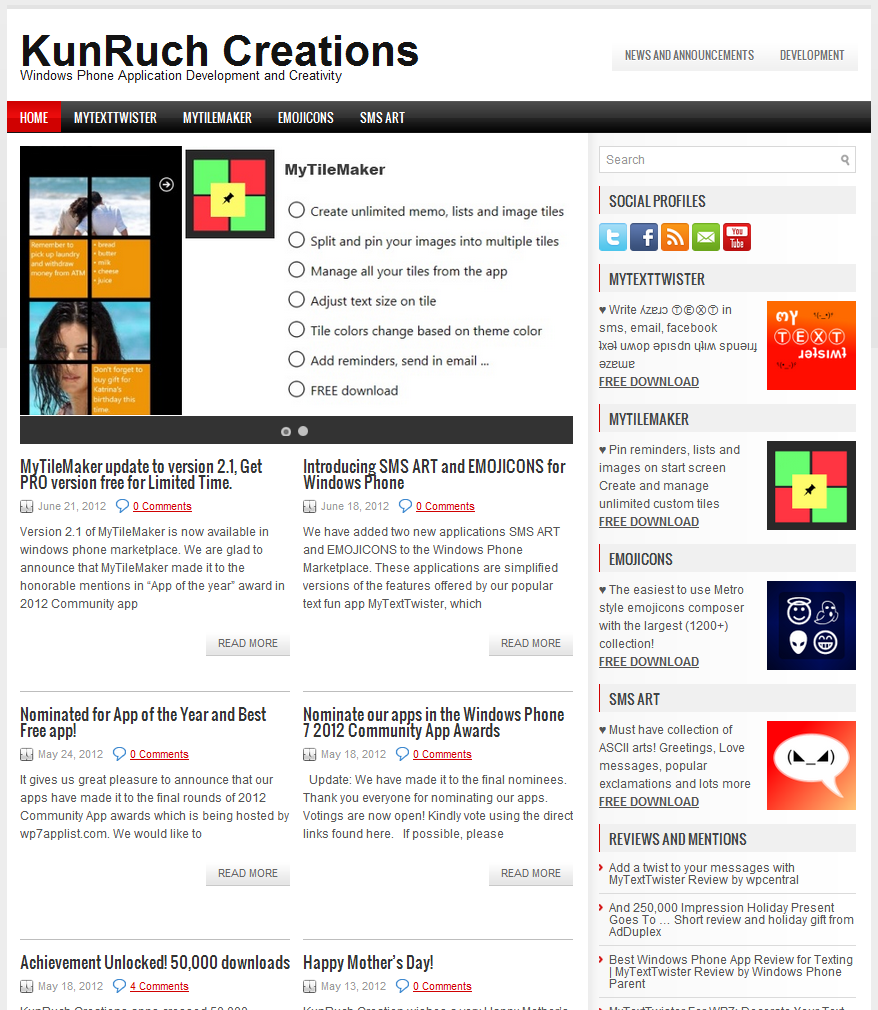
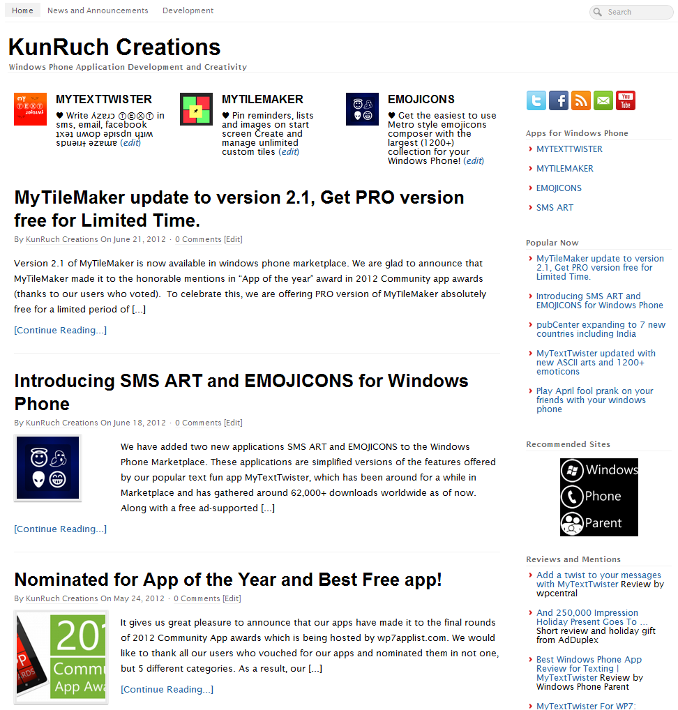
We are great fan of Metro design principles and we love the way Windows Phone UI is built with Metro as underlying design. Metro is a modern and clean design language created by Microsoft. The key principle behind Metro is to celebrate typography which means give more importance to content than to the extra jazz around it. Why? Because content is what everyone is interested in and a clean representation of content is what makes Metro user friendly.
Until now, we have tried and kept all our apps as close to the metro design principles as possible, but somehow our website design was not there completely. We couldn't resist but invest some time in restructuring the look of our site and make it more metro friendly and therefore more User friendly. Our new design has a more cleaner representation of content. We have removed all the jazz (yeh, that slider also on the top) and have kept the content which now features more prominently.
Below you can find a screen comparison of the earlier look and the new look.
With this new design, we are also promising a series of windows phone development related articles on our site. We will be sharing our experiences and thoughts about development on Windows Phone and hope to contribute back a little to this growing windows phone developer community.
P.S. In case the web designer in you is wondering, we are using the "PageLines" wordpress theme which is developed by PageLines.com. We have done our own custom CSS styling and few tweaks here and there to get to the desired result.

